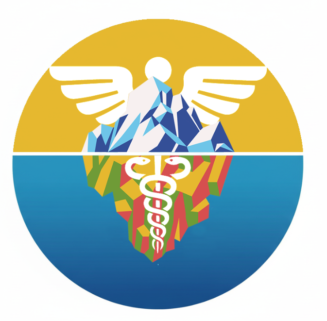
NAMS CONFERENCE GRAPHIC
DIGITAL ILLUSTRATION/DESIGN
This Design is for an upcoming conference hosted by the National Association of Medical Spanish(NAMS). The process of creating this graphic involved a lot of communication between the members of NAMS and myself.
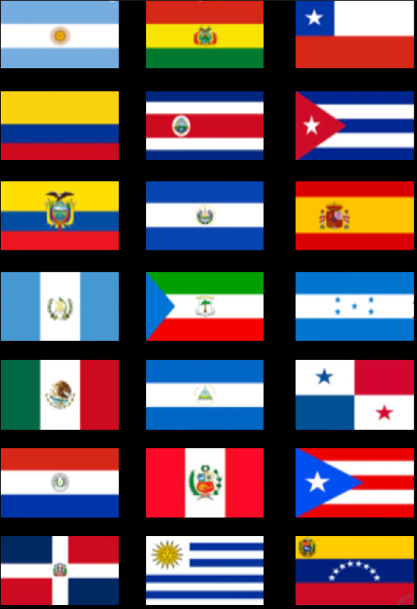
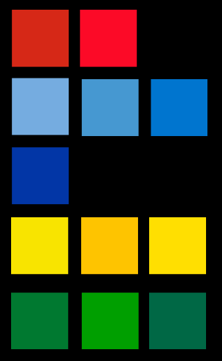
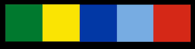
I started out by developing a color palette. Because Spanish is such a widely spoken language, and it was so important to represent many different nationalities, I sampled colors from the flags of every Spanish-Speaking Nation.
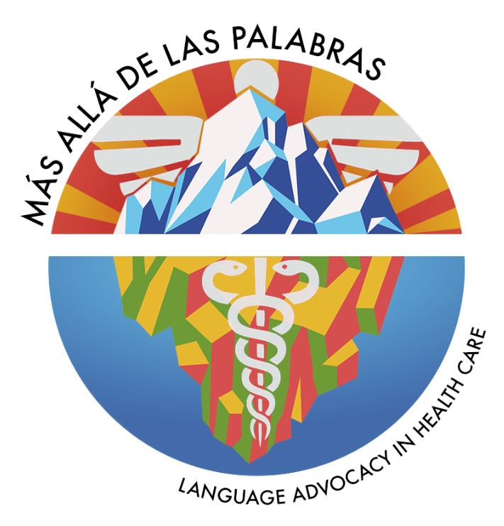
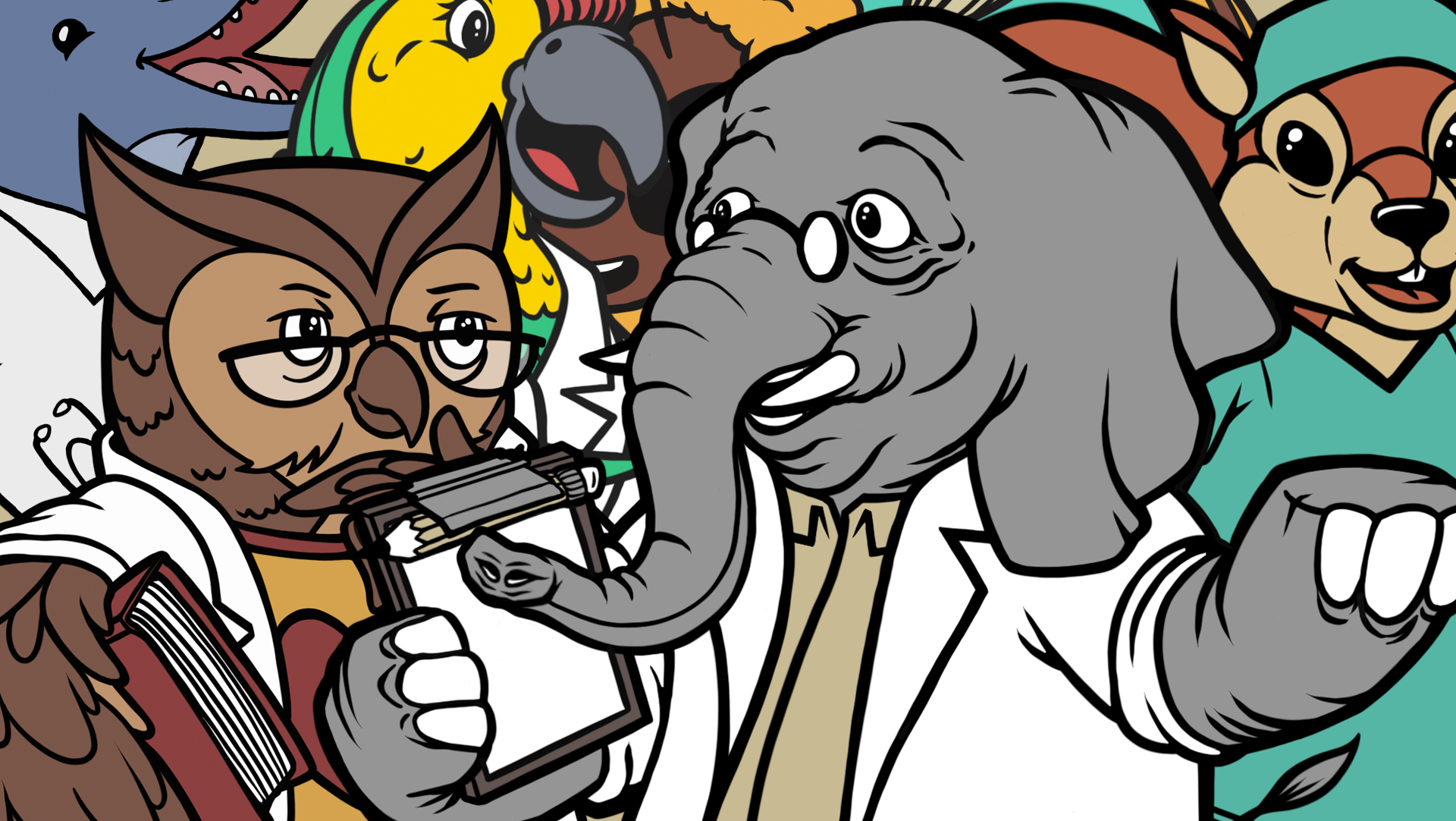
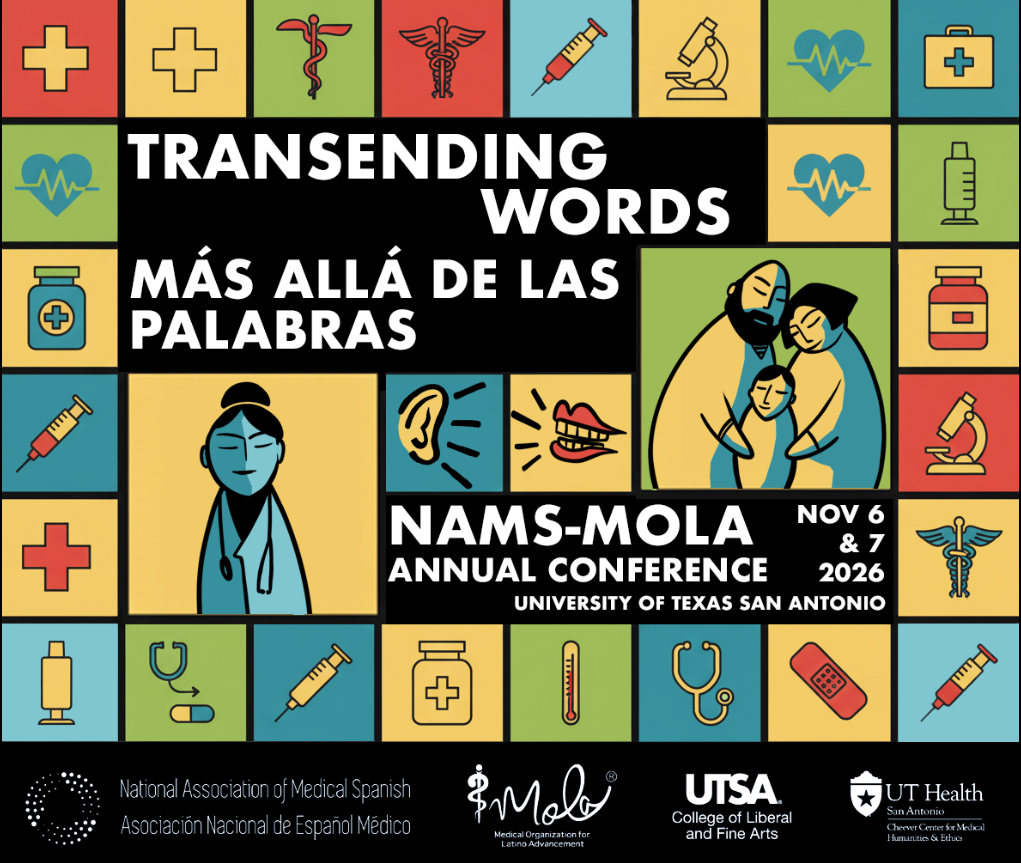
I then created several concepts that use these colors. The first was a grid involving various symbols related to medicine, with the center being an illustration highlighting communication between doctors and families.
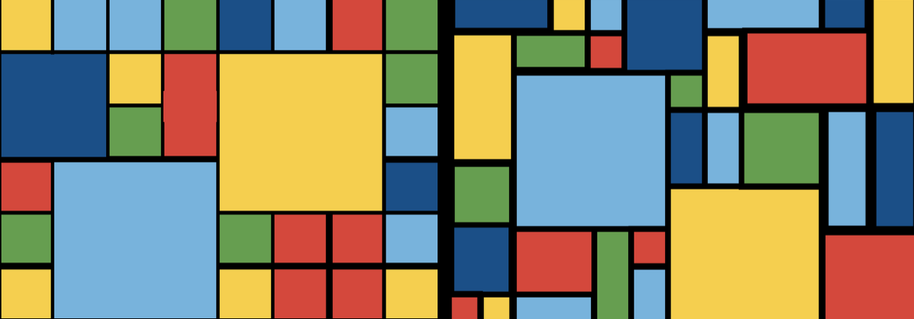
For the second concept, I BEGAN BY removing the illustrations and making the grid pattern less rigid.
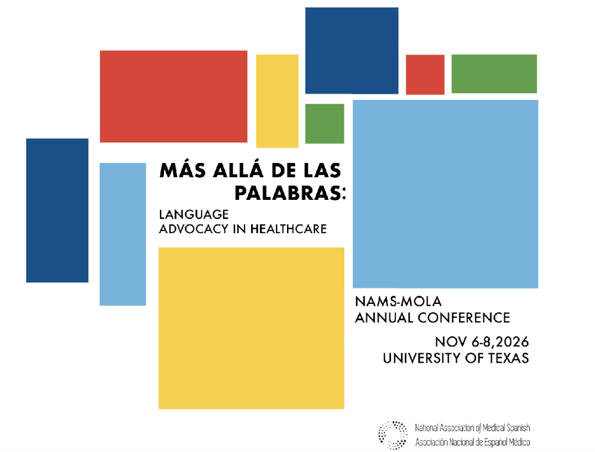
I then reduced the pattern to just two rectangles of each color, and arranged them in a Piet Mondrian inspired composition, using type to balance the larger shapes.
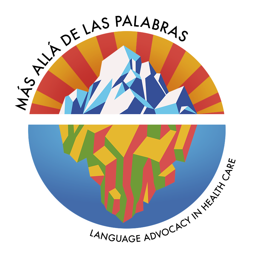
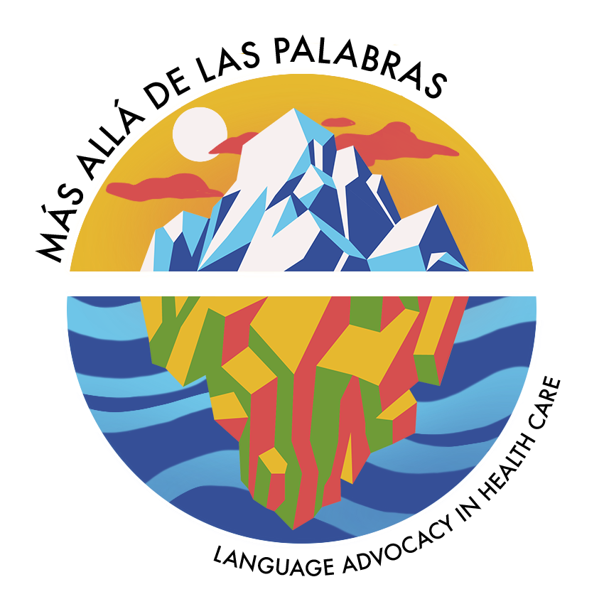
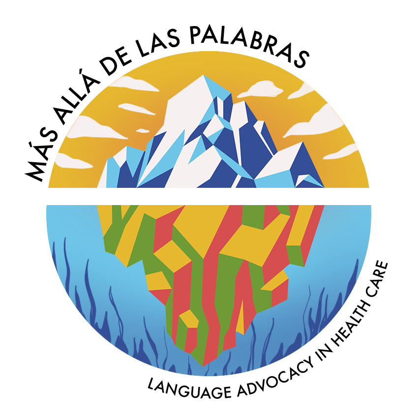
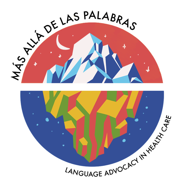
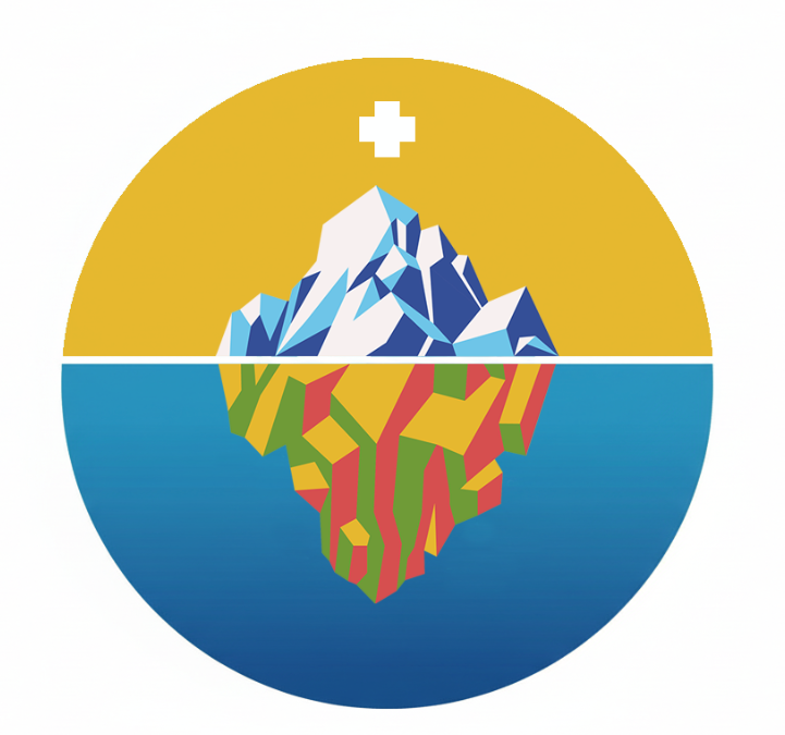
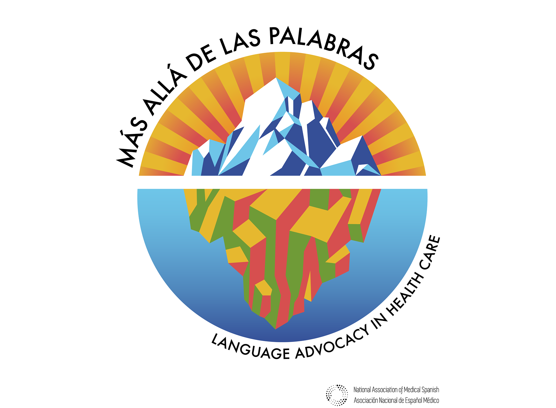
The concept we ended up going with was one of the iceberg, a symbol that carries significance for the NAMS team. They see it as a metaphor for communication: what we consider communication, speaking, is only one surface level component of a larger framework. Much of their work deals with the aspects we might not immediately think about, the submerged parts of this Iceberg.
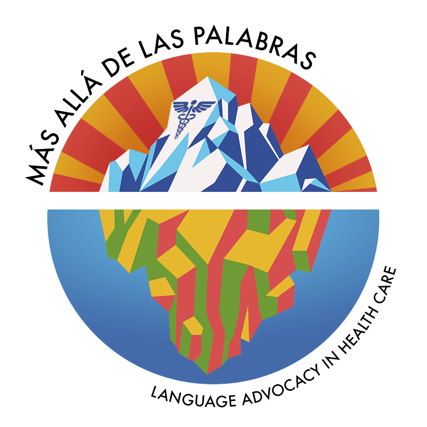
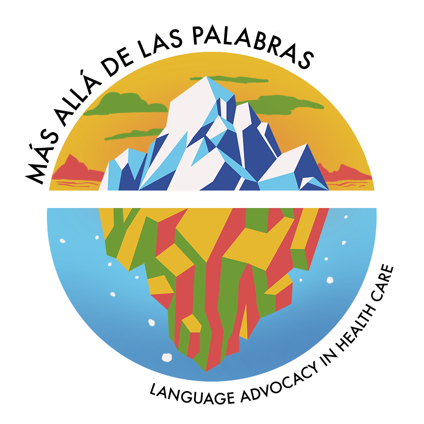
Before we agreed on a final image, I tried out many different variations and styles. We wanted to make sure the graphic would convey exactly what they wanted to communicate to their audience.