High-Fidelity WEBSITE PROTOTYPES
UX/UI DESIGN
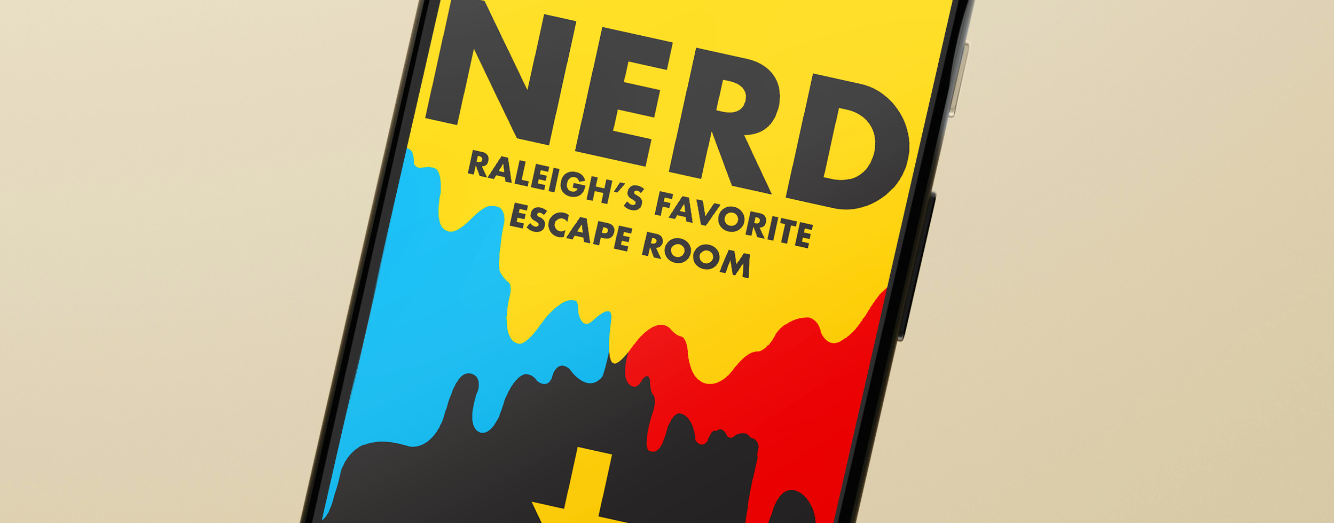
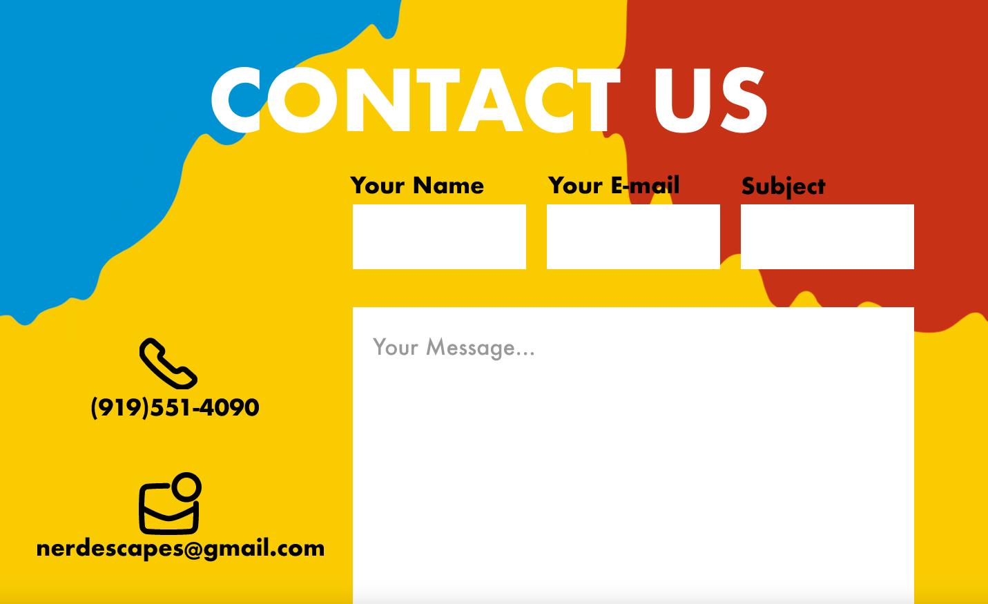
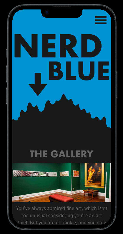
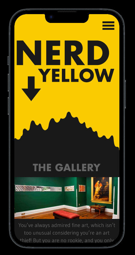
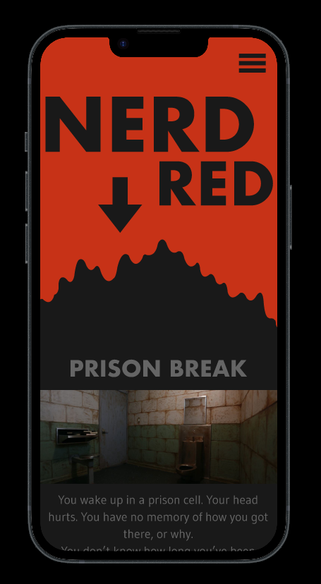
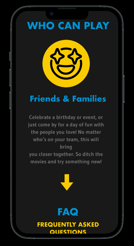
NerD is a popular escape room in Raleigh, NC. They wanted to update their website to match their colorful aesthetic. The majority of their web traffic comes from smart phones, so it was important for me to create an adaptive experience that would be fun and seamless on a mobile device.
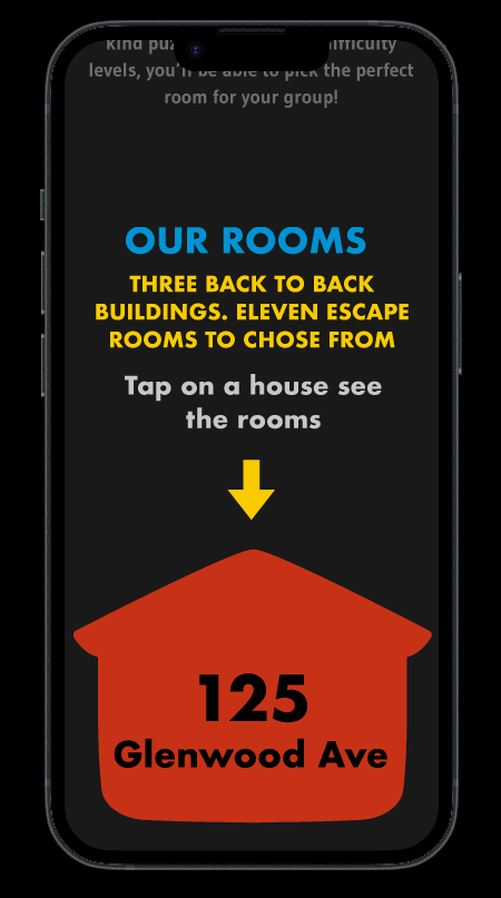
NERD IS BASED OUT OF THREE SEPERATE BUILDINGS that are next door to one another. They are called NERD RED, NERD YELLOW, and NERD BLUE. I wanted to use these primary colors as my theme for the site, while creating a design that could work in each of these colors individually.
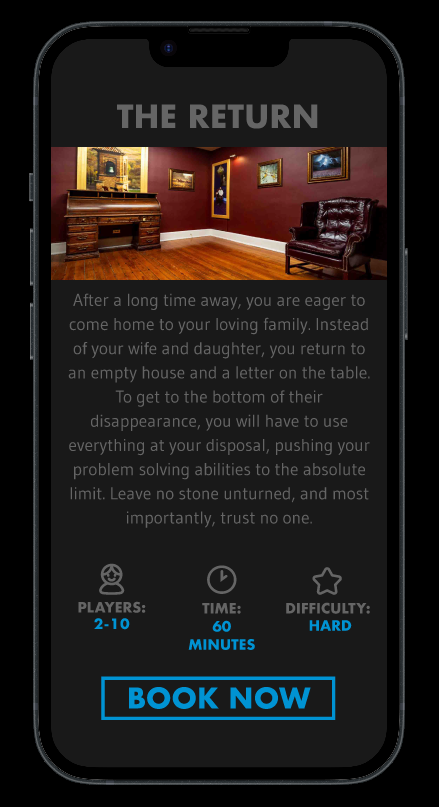
I designed everything to be as straightforward and simple as possible, with large, bold call to action buttons and a clear interface.
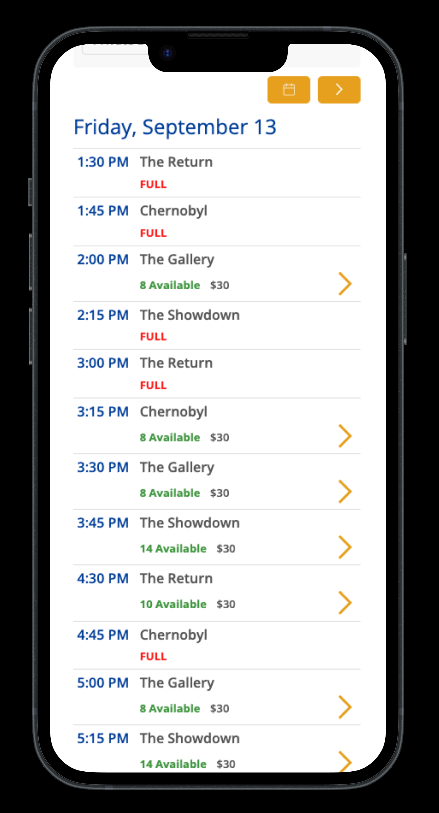
SINCE it's a website for an escape room, i wanted it to be fun and tactile. I made sure to include swiping and tapping on the landing page interface, to make the web experience have the same mood as the business itself.
For the PC version of the site, I kept everything clean and brightly colored, making sure to balance red, yellow, and blue throughout the experience.
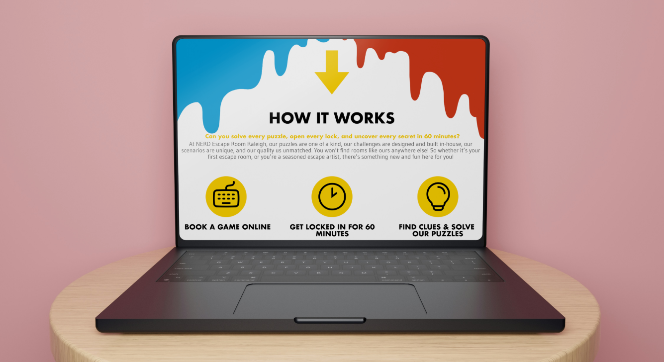
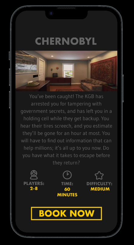
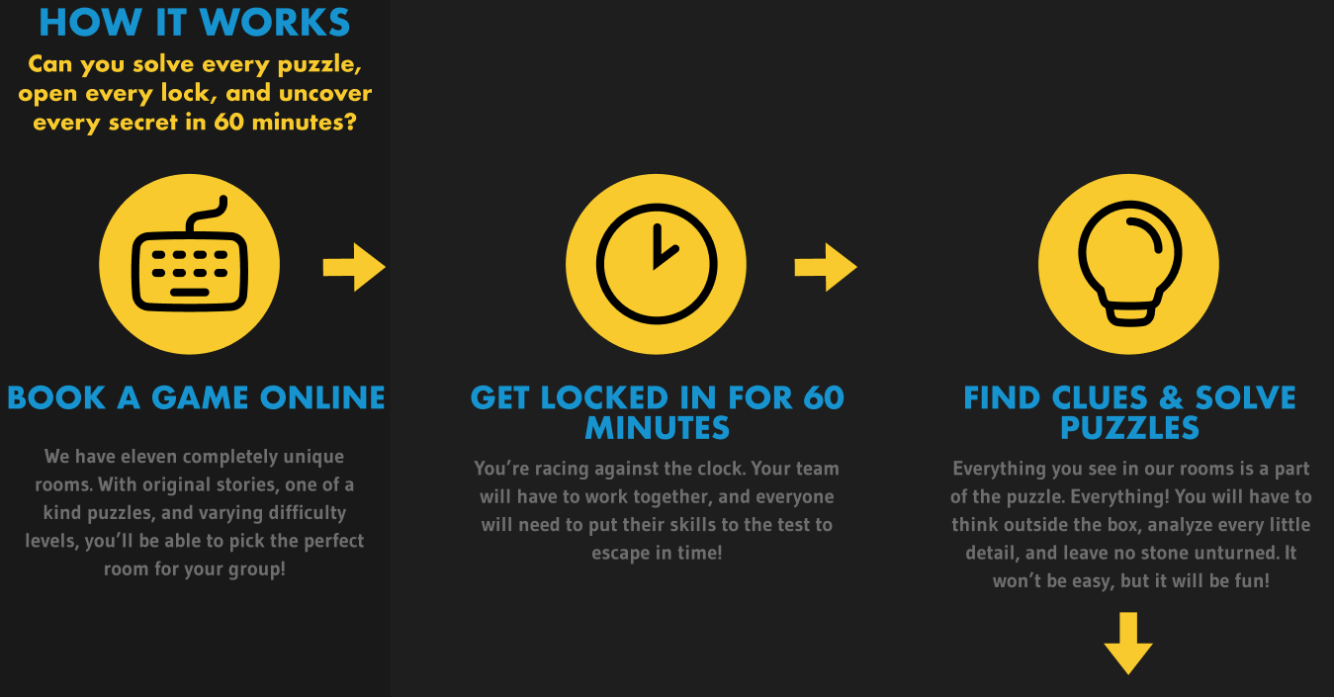
Because escape rooms aren't a type of entertainment everyone is familiar with, my goal was to make everything as clear and free of hurdles as possible. A quick explanation of what to expect, followed by a guided tour of the rooms and booking.